Brand Kit
Official assets and guidelines for the Playeasy brand family.
Generated Aug 21, 2026, 07:31 PM UTC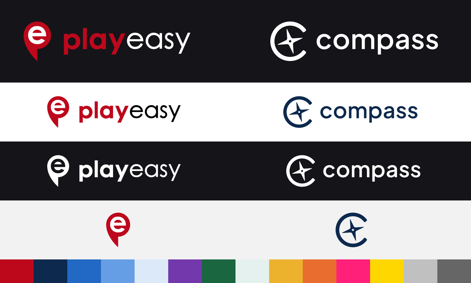
















Color Palette
Typography
Plus Jakarta Sans — loaded from Google Fonts
Font Weights| Weight | Name | Sample |
|---|---|---|
| 300 | Light | The quick brown fox jumps over the lazy dog |
| 400 | Regular | The quick brown fox jumps over the lazy dog |
| 500 | Medium | The quick brown fox jumps over the lazy dog |
| 600 | SemiBold | The quick brown fox jumps over the lazy dog |
| 700 | Bold | The quick brown fox jumps over the lazy dog |
| Variant | Sample | Size | Weight | Line Height | Usage |
|---|---|---|---|---|---|
display1 | Aa | 5.25rem | 400 | 1.2 | Hero displays, major landing headers |
display2 | Aa | 4rem | 400 | 1.2 | Section heroes, large marketing headers |
h1 | Aa | 5rem | 300 | 1.167 | Page titles |
h2 | Aa | 3.75rem | 300 | 1.2 | Major section titles |
h3 | Aa | 3rem | 400 | 1.167 | Sub-section titles |
h4 | Aa | 2.125rem | 400 | 1.235 | Card titles, modal headers |
h5 | Aa | 1.5rem | 400 | 1.334 | Section headings |
h6 | Aa | 1.25rem | 500 | 1.6 | Minor headings, sidebar titles |
callout | Aa | 2rem | 400 | 1.2 | Pull quotes, callout text |
subtitle1 | Aa | 1rem | 400 | 1.75 | Subtitles, secondary labels |
subtitle2 | Aa | 0.875rem | 500 | 1.57 | Small subtitles, table headers |
body1 | Aa | 1rem | 400 | 1.5 | Primary body text |
body2 | Aa | 0.875rem | 400 | 1.43 | Secondary body text, descriptions |
body3 | Aa | 0.7rem | 400 | 1.2 | Fine print, micro labels |
button | Aa | 0.875rem | 500 | 1.75 | Button labels |
caption | Aa | 0.75rem | 400 | 1.66 | Captions, helper text |
overline | Aa | 0.75rem | 400 | 2.66 | Labels, tags, section markers |
Playeasy Brand Guide
Everything you need to build on-brand presentations and landing pages for the Playeasy company brands. Pick a brand, follow its recipe; the shared Type, Style, Assets, and Avoid rules apply to both.
The JSON block that follows this guide carries the machine-readable colors and images: tokens is the shared hex palette, and each brands[] entry has its id, its logo/icon/wordmark assets (raw svgContent plus a fetchable assetUrl), and its slide colors. Apply the values exactly as given — never invent or recolor colors, fonts, or logos.
Playeasy / Platform
Bold, confident, a little edgy.
- Background: dark
#151419(primary) or light#f2f2f2 - Text: white
#ffffffon dark,#000000on light; muted#7a8c9e - Accent: red
#bd081c— the title bar, dividers, small details - Structure (buttons, links, highlight panels, pills): red
#bd081c— Playeasy uses one color; red is both accent and structure - Logo: the red "e" pin mark; use the reversed (white "easy") logo on dark backgrounds and the default logo on light — the default's navy wordmark is unreadable on dark
- Slides: header with the Playeasy logo + "Playeasy / Section" at top-left, "Page X of Y" at top-right, a thin rule beneath
- Signature look: bold headlines; red as a sharp accent on real elements (title accent bar, icon, divider) — not decoration
Compass
Refined, navigational, trustworthy.
- Background: navy
#0d294d(preferred) or light#f2f2f2 - Text: white
#ffffffon navy,#000000on light; secondary text pale blue#dce9f9on navy (gray#7a8c9eon light). Never red — red text on navy clashes - Accents only (bars, dots, arrows, dividers): red
#bd081c— graphic accents, never text or large fills - Structure (buttons, links, highlight panels, pills): blue
#2169c4 - Logo: white (reversed) on navy, default on light
- Slides: header with the Compass logo + "Compass / Section" at top-left, "Page X of Y" at top-right, a thin rule beneath
- Signature look: numbered sections (big number + red divider); cards as slightly lighter/darker navy panels; red dots/lines only when tracing a real sequence, not as filler
Type (both)
Plus Jakarta Sans (free on Google Fonts), fallback "Plus Jakarta Sans", Helvetica, Arial, sans-serif.
- Weights 700 headlines · 500 subheads · 400 body. Use 300 or 600 only for large Compass display headings/numbers — never for body or normal headings.
- Big bold headlines (~4–7rem), comfortable body (~1–1.25rem). Title case for headlines in both brands; acronyms and product names keep their standard capitalization. Optionally italicize one key phrase in a hero headline.
Marketing type scale:
| Role | Size | Weight |
|---|---|---|
| Hero | 7rem | 700 |
| Display | 5.5rem | 700 |
| Heading | 3.5rem | 700 |
| Subhead | 2rem | 500 |
| Lead | 1.5rem | 400 |
| Body | 1.25rem | 400 |
| Small | 1rem | 400 |
| Caption | 0.875rem | 500 |
Style (both)
- Pill buttons (fully rounded), filled with the accent color, white text
- Rounded corners (8–12px), generous spacing, left-aligned, uncluttered
- One clear headline per section; muted subheads; bold a single key phrase for emphasis
logo= icon mark + wordmark (default for representing the brand);wordmark= text only, no icon (use only when the icon already appears elsewhere in the layout)
Assets
Each brand's assets lists logos/wordmarks/icons by type and variant. Render svgContent directly — e.g. <img src={data:image/svg+xml;charset=utf-8,${encodeURIComponent(svgContent)}} /> — or inline the markup; no host fetch needed. When svgContent is absent, fetch the asset's assetUrl (a real SVG URL). Pick the reversed/white variant on dark backgrounds and the default variant on light. Preserve each logo's aspect ratio — never stretch, squash, recolor, or restyle it; scale proportionally and pad with whitespace rather than filling a box. Do not mix Playeasy and Compass brand elements unless explicitly asked.
Avoid
Any background pattern — grids, line-art, blueprint or topographic textures, noise, gradients behind content; backgrounds are flat color, nothing layered on them · other bright colors as the main color · red as a text color on Compass (red is accent-only there) · weights 300/600 (except Compass display numbers) · sharp-cornered buttons · recolored, stretched, or restyled logos · busy, cramped layouts · full-width bars or edge stripes purely for decoration (reads as generic filler) · red dividers/dots not tied to real content.